Capitalmind Mutual Fund · 2025
Capitalmind Mutual FundLeading a fund's launch identity through an agency
A brand identity for Capitalmind's new retail mutual fund. An external agency designed it; I was the design lead on Capitalmind's side: I set the brief, steered the agency through three rounds to the founders' sign-off, then carried the identity into the launch myself.
- Role
- Art director: brief, direction and review; identity designed by an external agency
- Client
- Capitalmind Mutual Fund
- Timeline
- 3 months, 2025 · three review rounds
About Capitalmind
Most Indian investors who know Capitalmind know it from PMS, AIF and a decade of writing that earned it a reputation for quant rigour and radical transparency. In 2025 it launched a retail mutual fund.
The brief I set
Capitalmind already had a name investors trusted: Capitalmind Financial Services. The brief to the agency was to build an identity for the new product, Capitalmind Mutual Fund, that carried parts of the parent brand into it. The fund would be talking to first-time SIP investors the parent had never spoken to, so it had to feel open to them and still read, unmistakably, as Capitalmind.
My role
I didn’t design this identity; an external agency did. I was the design lead on Capitalmind’s side and the agency’s day-to-day point of contact: setting the brief, reviewing every round, and translating between the agency and the founders.
Three rounds to a yes
Round one: too far from the parent. The first options were very simple, and they drifted a long way from Capitalmind. The founders and I pushed back. The parent brand had already earned its name and reputation; the whole point was for the fund to be part of it.
Round two: the right parts, the wrong expression. This time the parent brand was in the work, but the options still didn’t express what leadership wanted. The founders came back with very specific ideas for the agency to try. After that presentation I sat with the agency’s creative director and suggested directions rather than solutions: enough to point them at what the founders were after, while leaving them room to explore. I was careful not to overstep.
Round three: the identity. We finalised the mark and the system. My part in the room was helping the agency make its case to the founders, with the business requirements in hand.
Getting the founders to sign off
The founders had the final word, and their feedback was strong and specific. Because I knew what they were looking for, I could make sure the agency answered what had been asked, while giving it a general direction instead of a list of instructions. That kept the agency’s craft in the work and the founders’ intent in the result.
The identity
The mark
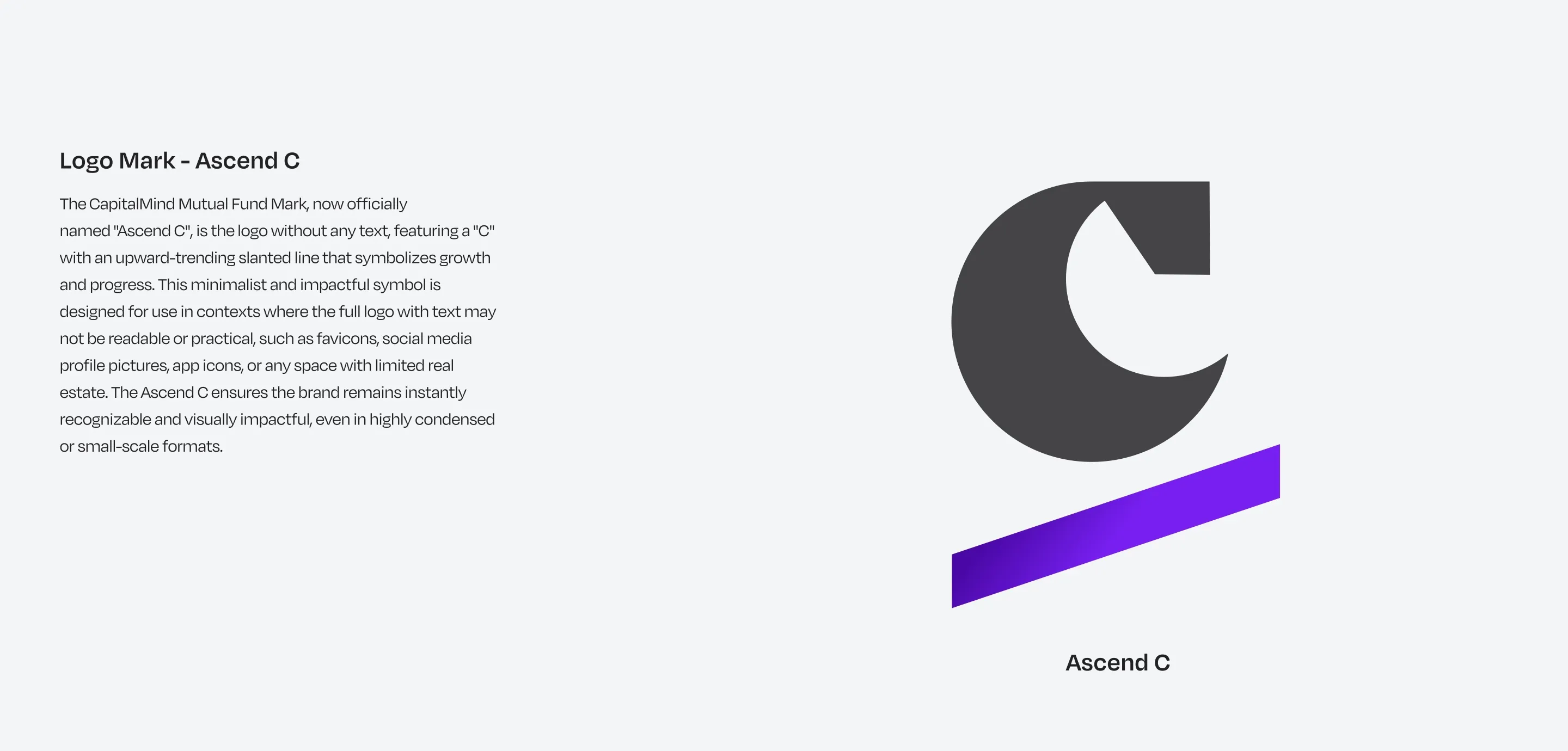
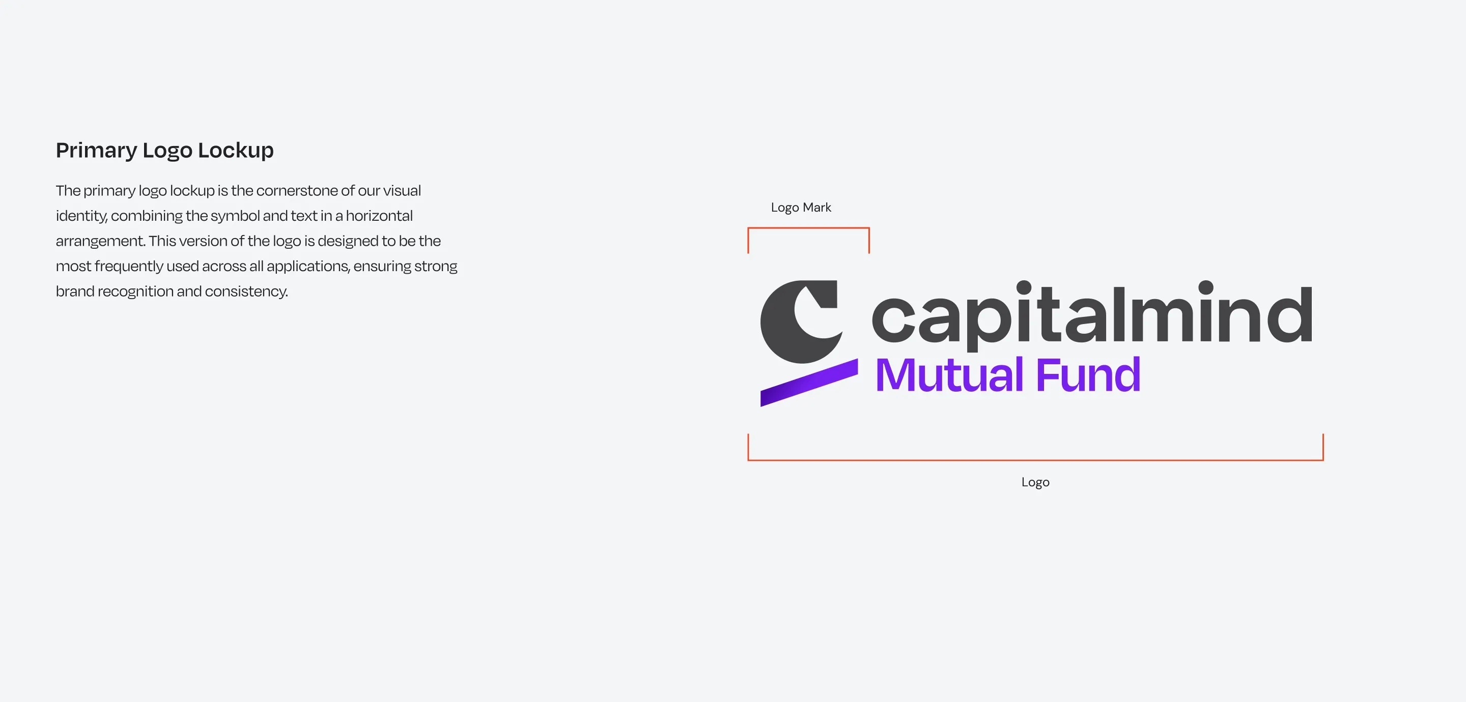
The mark is the Ascend C: a C with an upward-slanting bar under it, for growth and progress. It stands on its own wherever the full logo won’t fit, from favicons to profile pictures.
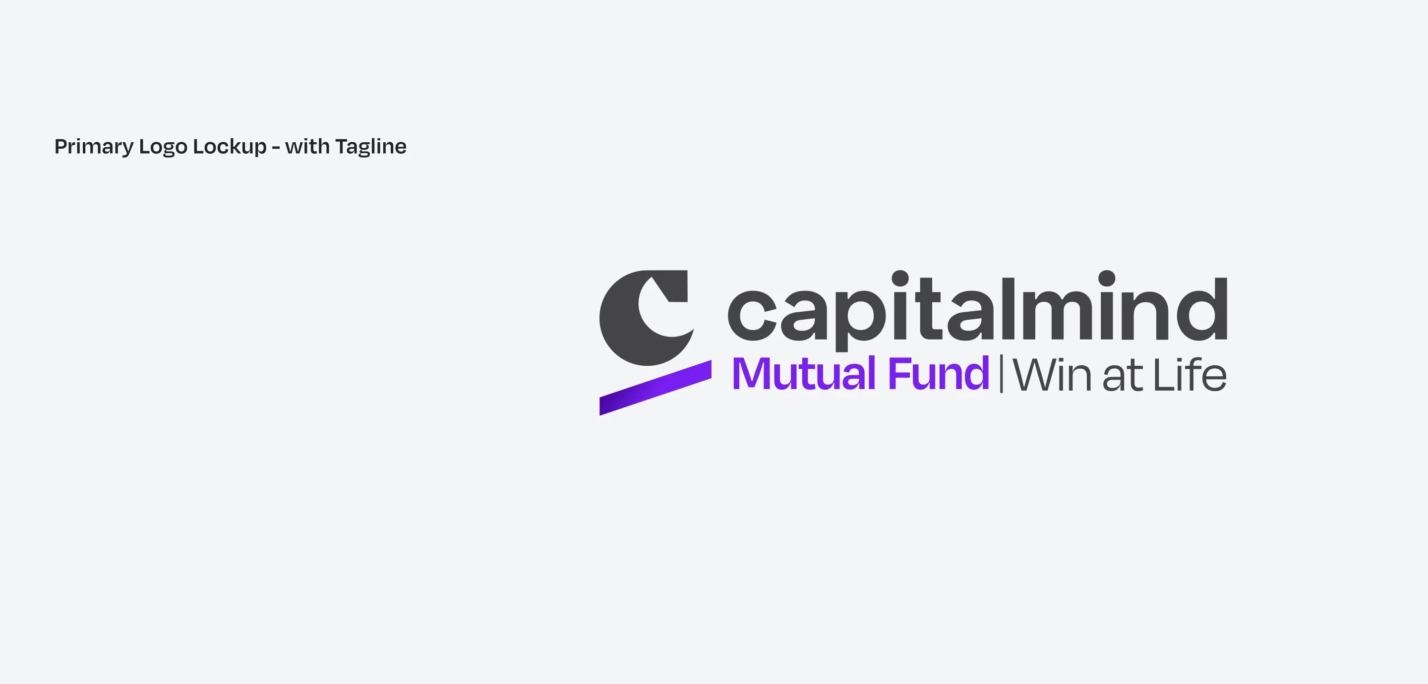
The tagline, Win at Life, frames wealth as a means, not an end.
Colour
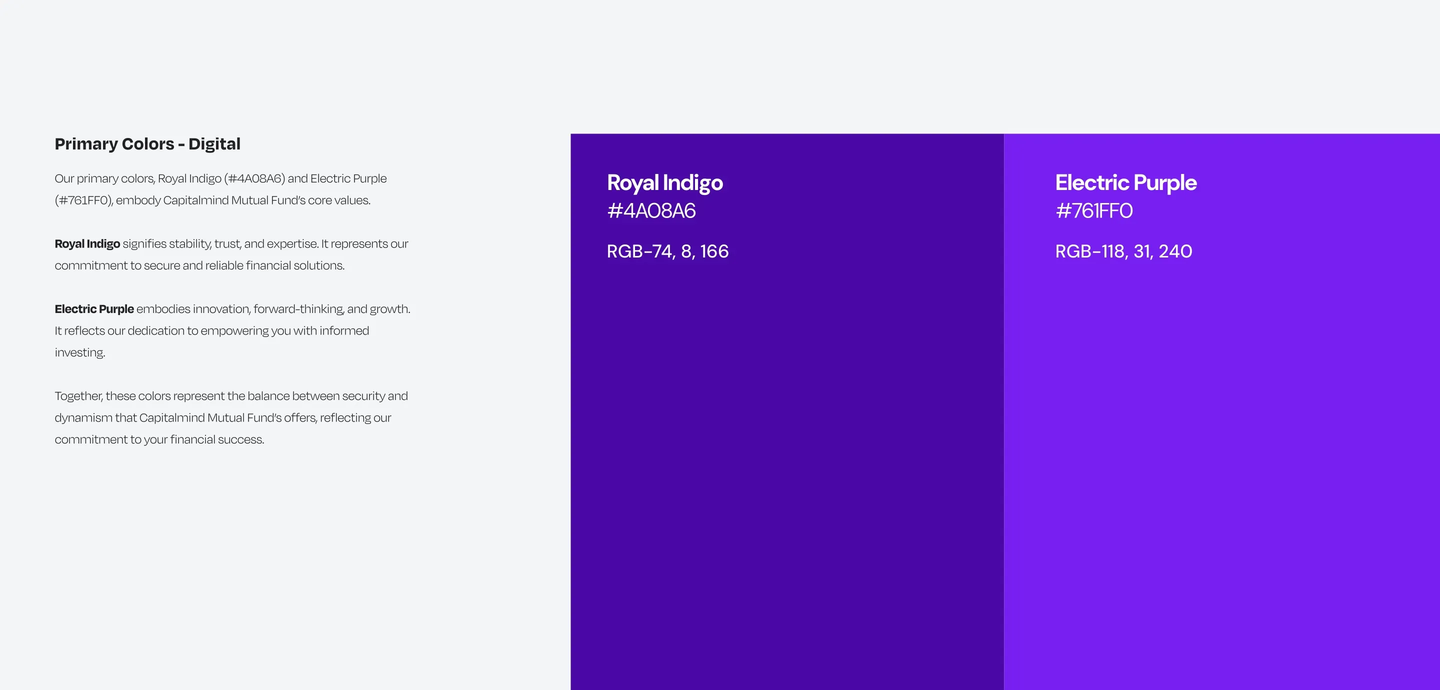
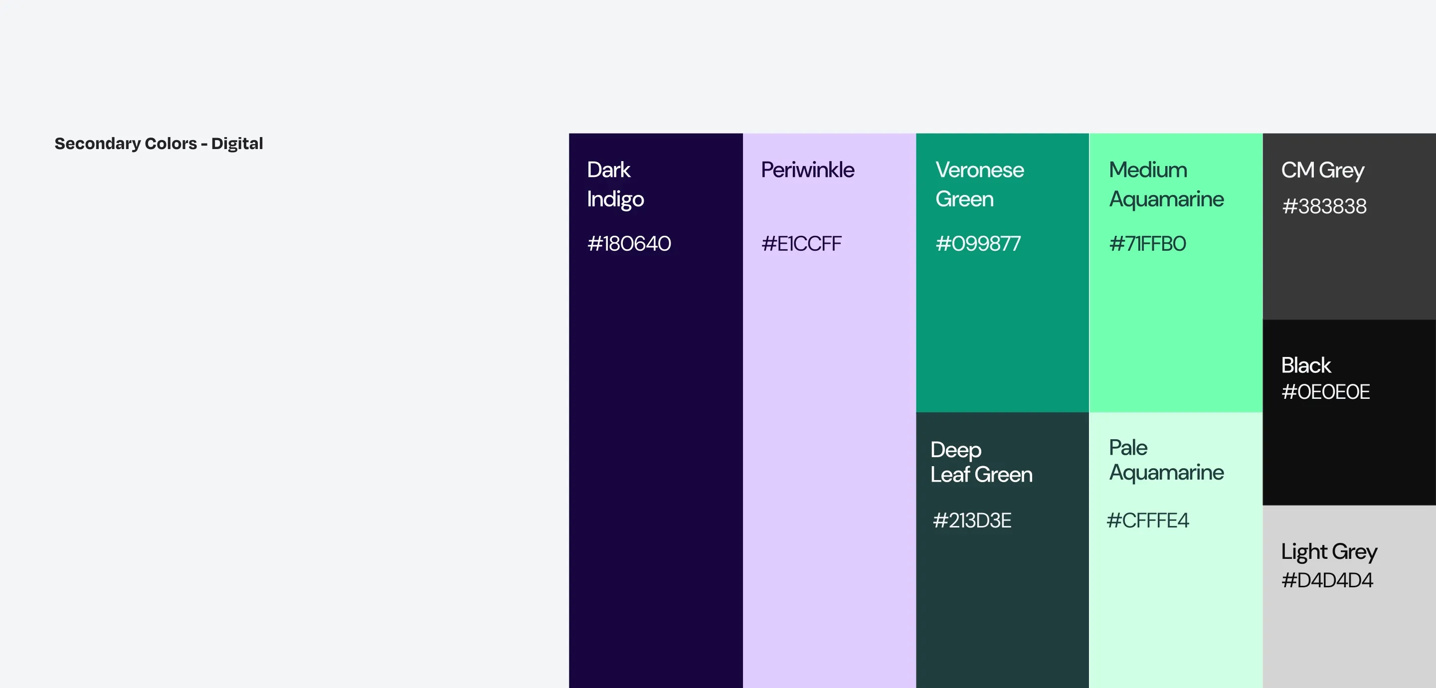
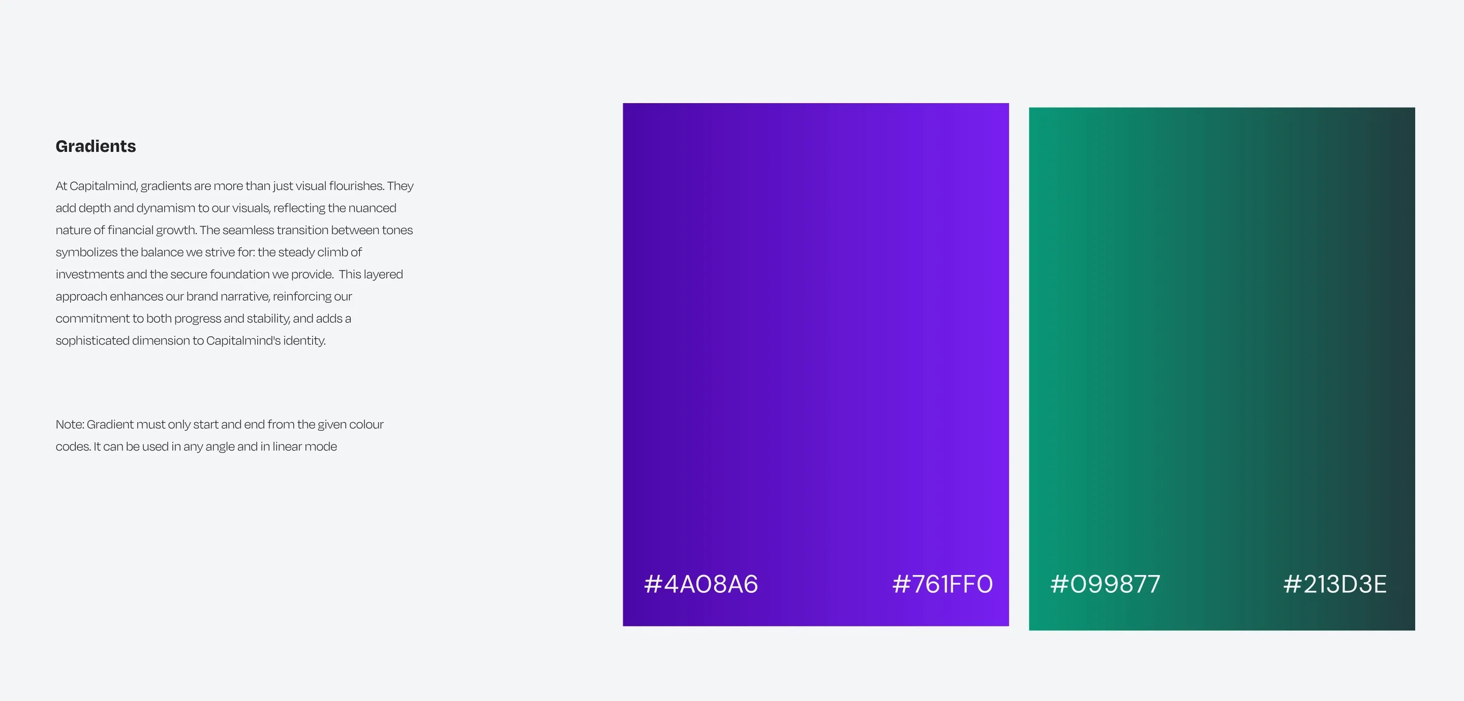
Royal Indigo stands for stability, Electric Purple for forward motion, and Veronese Green is the warm counterpoint that the human side of the brand leans on.
Type
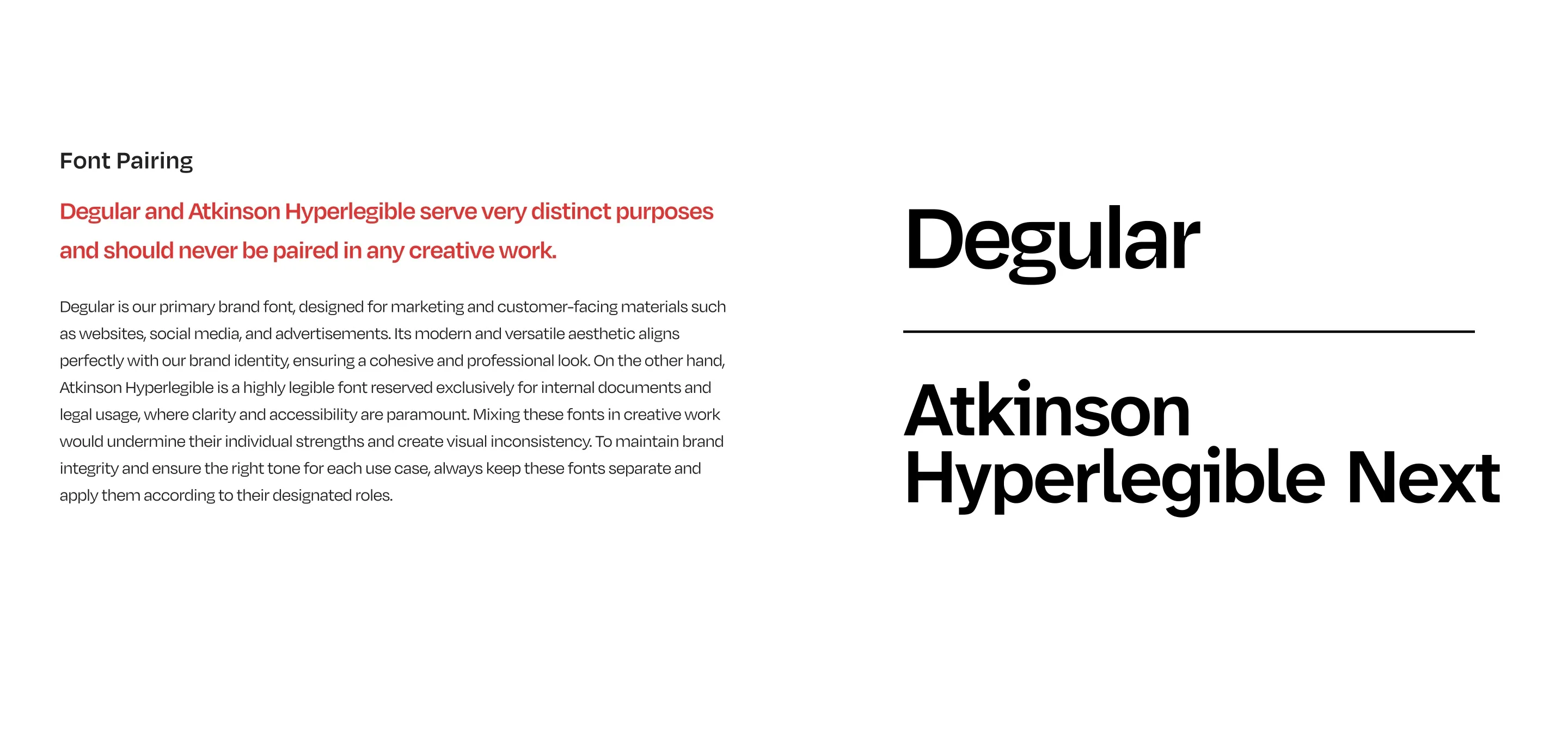
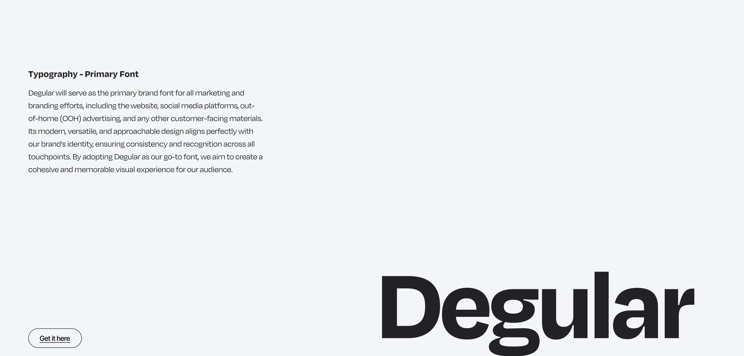
Degular carries everything customer-facing. Atkinson Hyperlegible Next is kept for internal and legal documents, where legibility beats personality. The two are never mixed in creative work.
Illustration
Two illustration families let the same brand sound analytical or human:
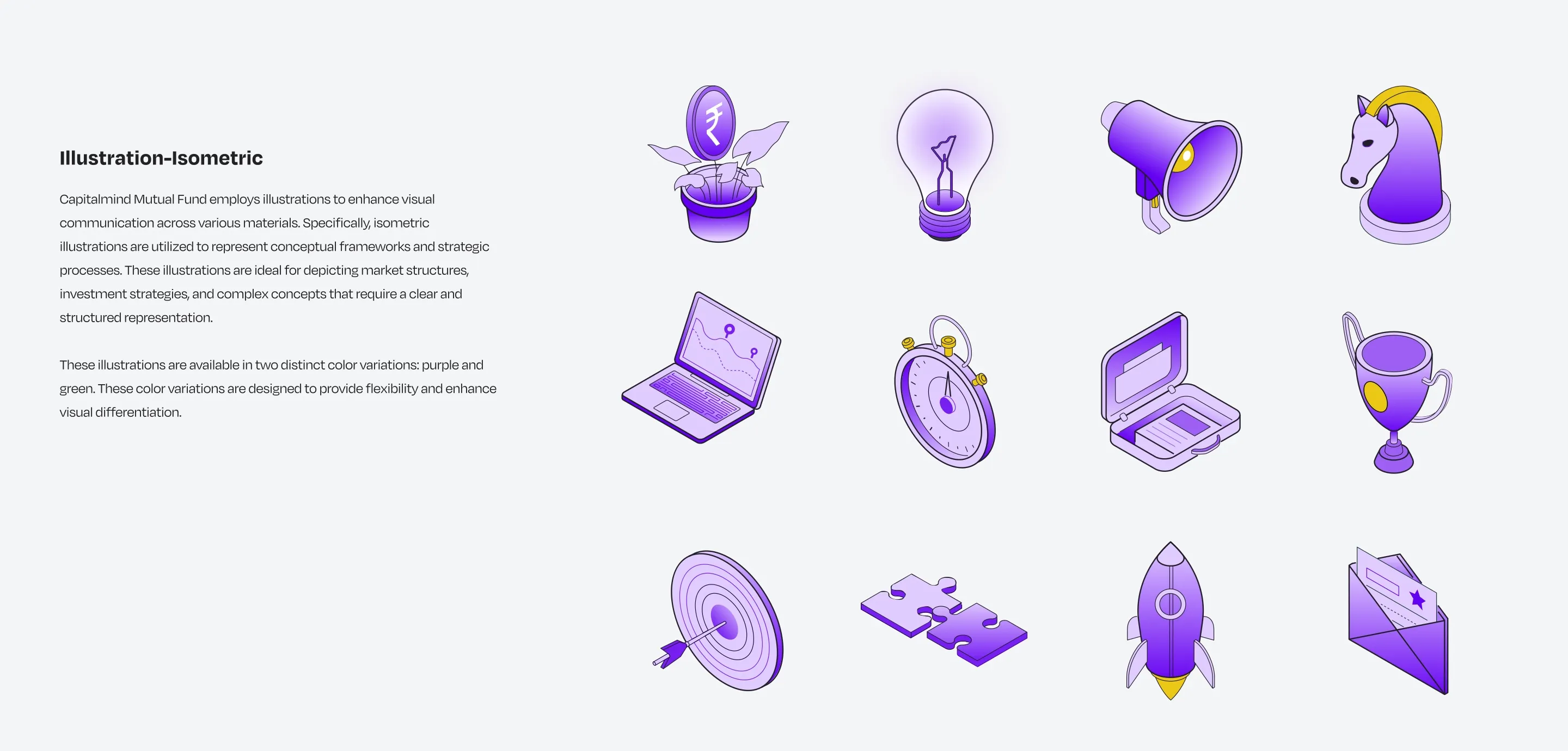
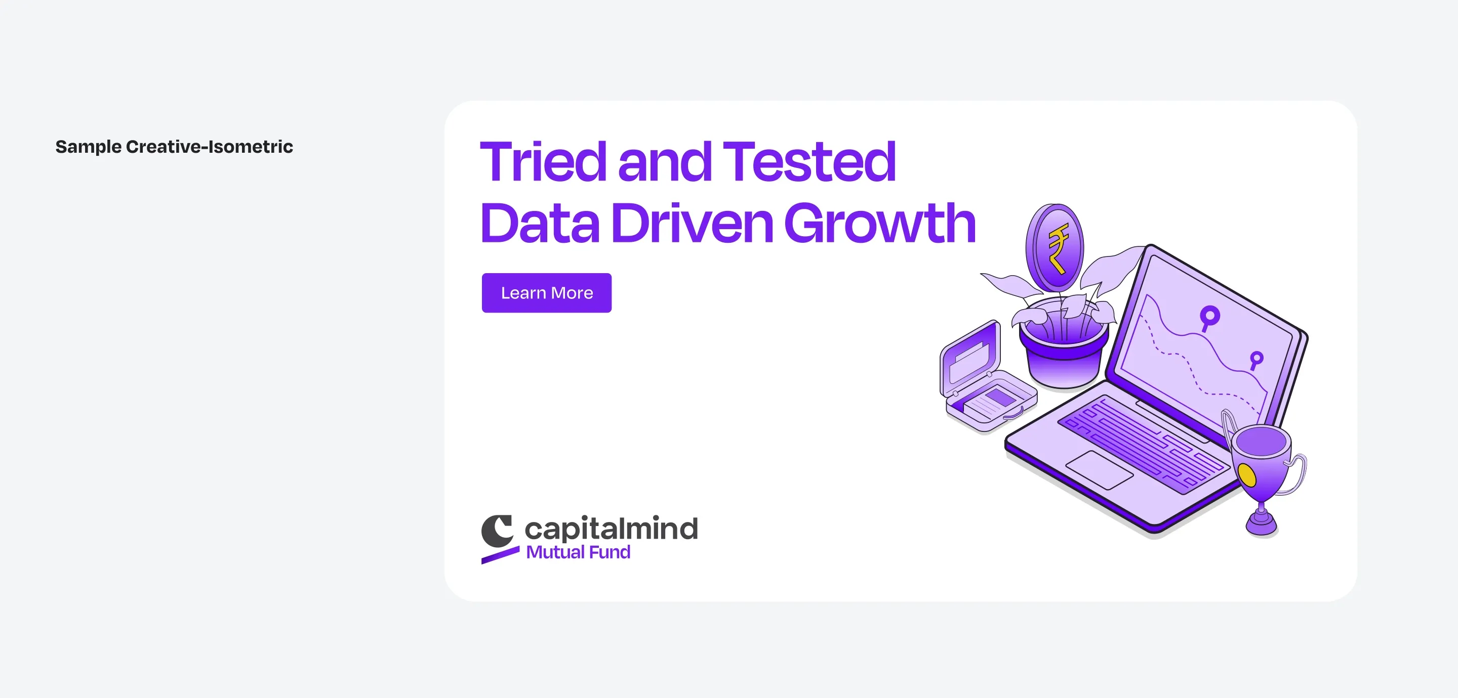
Isometric for the analytical side: market processes, strategy and structured ideas.
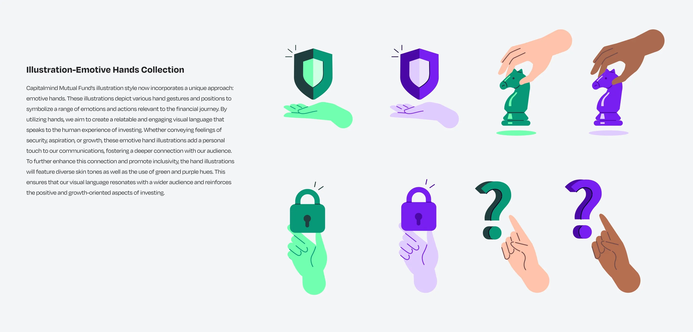
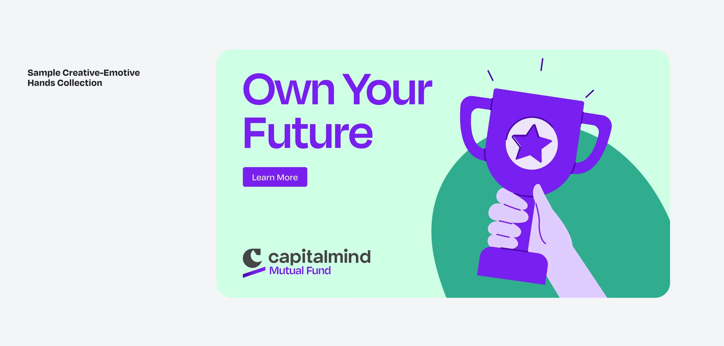
Emotive Hands for the human side: security, aspiration and growth, drawn in diverse skin tones as well as the brand’s green and purple.
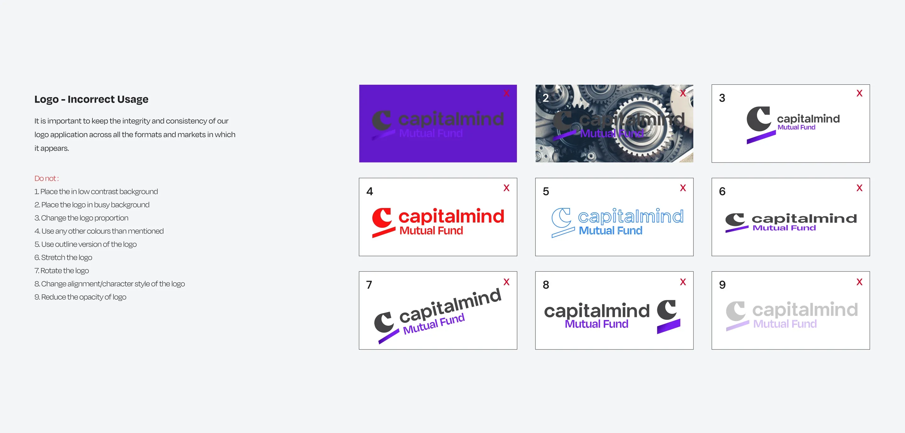
See the rest of the system: lockups, misuse, full palette, type, pattern, icons and samples
Pattern
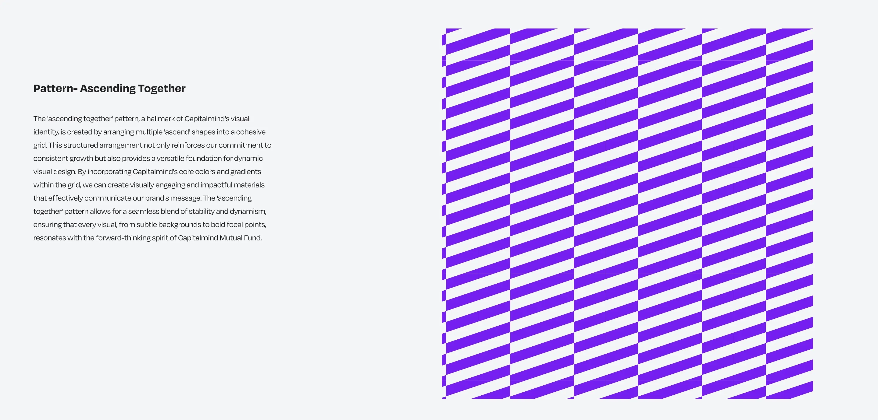
The Ascend bar from the mark repeats into patterns, used as backgrounds or overlays.
Icons
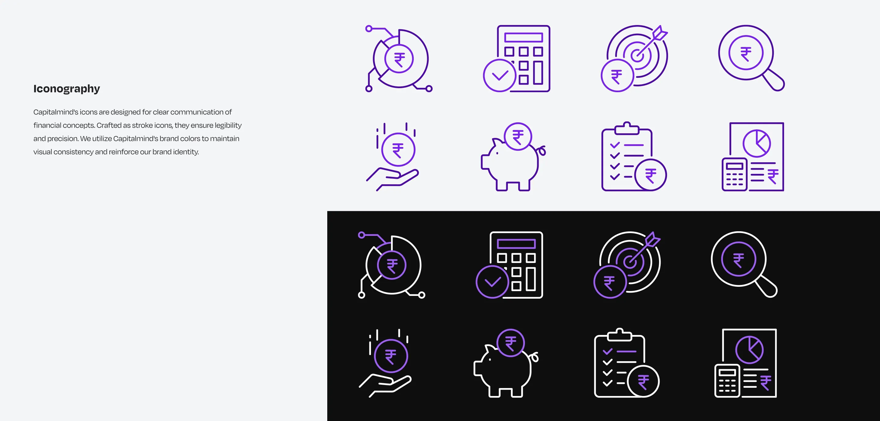
In use
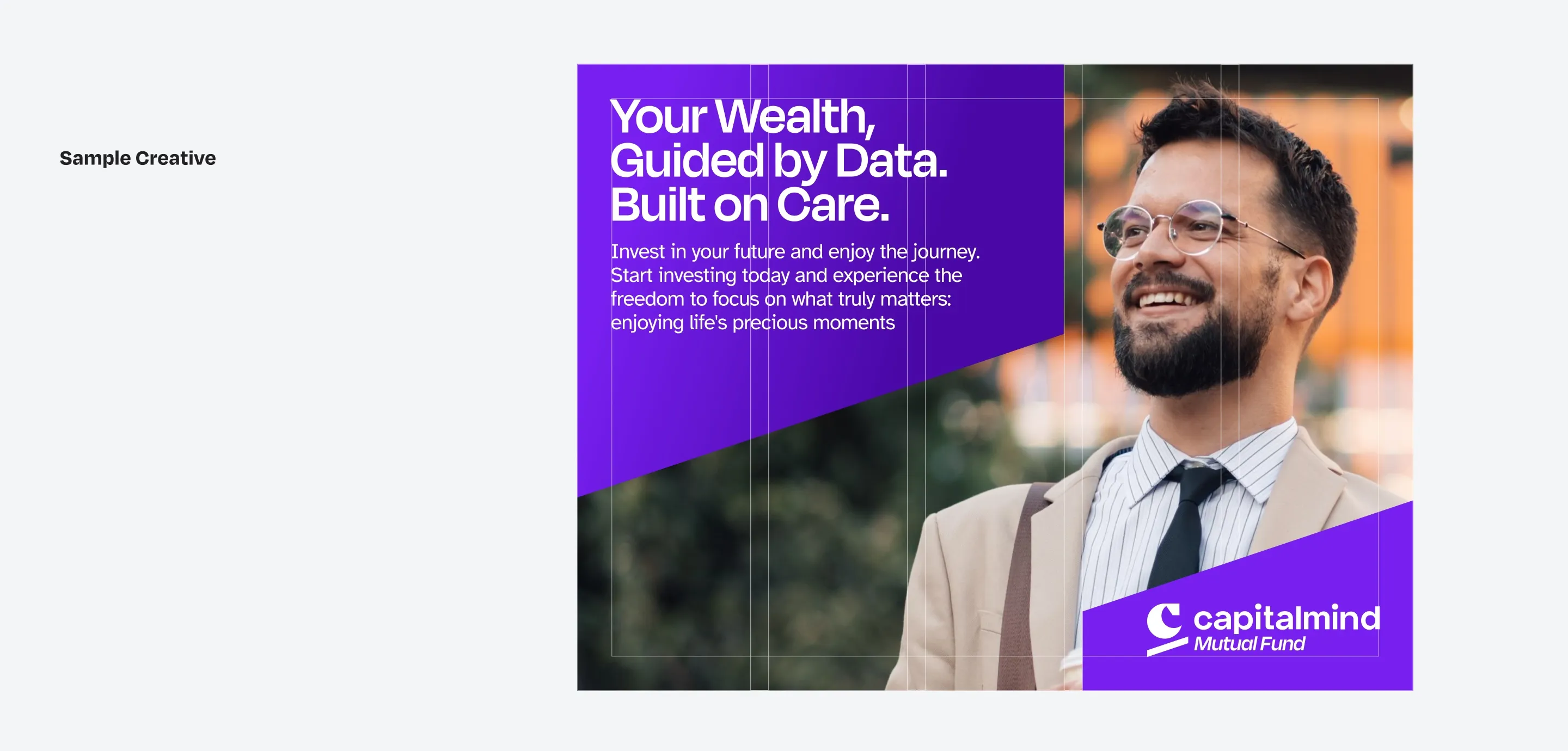
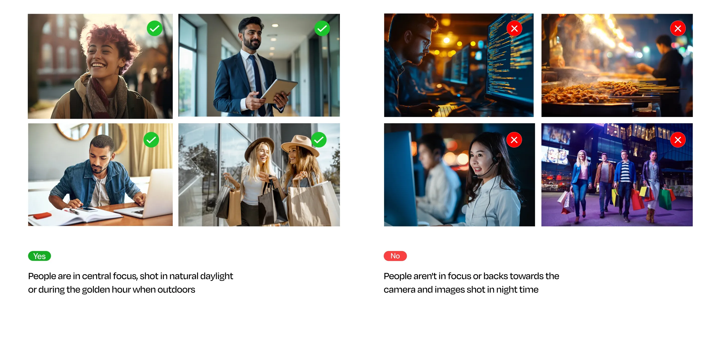
Taking it to launch
The fund’s first scheme, Capitalmind Flexi Cap Fund, opened for subscription on 18 July 2025. I carried the identity into the marketing, YouTube and podcast creative for the fund and its sponsor, and later designed and built the Flexi Cap and Multi Asset landing pages, which went live in 2026.
What I learned about working with an agency
- Write discovery down. The agency ran workshops to learn what each of us in leadership wanted, but the documentation could have been better. Somewhere in the feedback rounds the founders’ expectations shifted a little, and a written record would have caught it.
- Get inside discovery early. I’d want to see the agency’s discovery plan up front, so I could add to it and firm up the vision before the first round, not after.
- Talk between reviews, not only at them. More regular calls with the agency would have let me help them design better, instead of only reacting to each presentation.
Credits
- Art direction: myself
- Brand identity design: an external agency
- Client: Capitalmind Mutual Fund