Sorting theletters

ಸ್ವಲ್ಪ ತಾಳಿ

Skip to content

GeoIQ · 2023

GeoIQArt-directing a location-intelligence rebrand

A new identity for GeoIQ, a platform that turns locations into insight. I set the direction and brought a designer onto my team to create it: the mark, type and colour, illustrations, and the collateral that carried it.

Role
Art director: brief, direction and review; design by Puja Kundu
Client
GeoIQ
Timeline
2 months, 2023
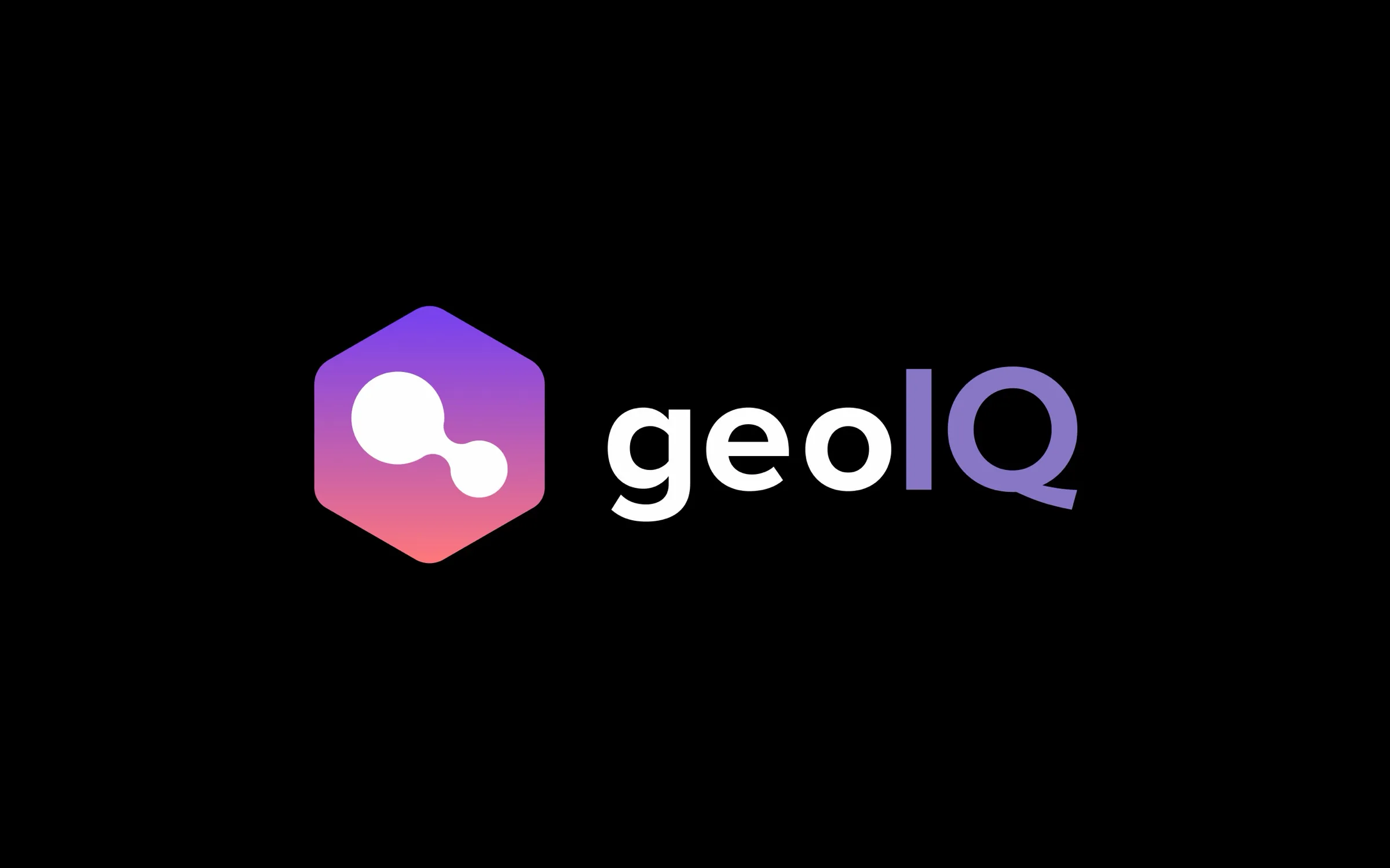
The new GeoIQ logo: a hexagonal mark in a purple-to-coral gradient holding two joined circles, beside the 'geoIQ' wordmark with IQ in purple, on black.

About GeoIQ

GeoIQ is a location-intelligence platform. It shows the value of a place (the people, behaviours, businesses and potential around it) through easy-to-read map layers, and lets teams create, share and analyse geospatial data from the browser.

Why rebrand

The old identity read like a traditional geospatial data provider. GeoIQ needed to explain its own approach and stand apart: to be seen as a data-intelligence firm whose analytics are clear, intuitive and tied to real use cases.

My role: art direction

I didn’t draw this identity; I directed it. I hired Puja Kundu into my team as a junior designer and asked her to design the rebrand. My part:

  • Setting the brief: why GeoIQ needed to rebrand, who it had to speak to, and what it had to stop looking like.
  • Directing the work: reviewing each round and making the calls on the mark, type, colour and illustration style.
  • Keeping it aligned with the marketing and product teams, so the identity served what they needed to say.

The mark
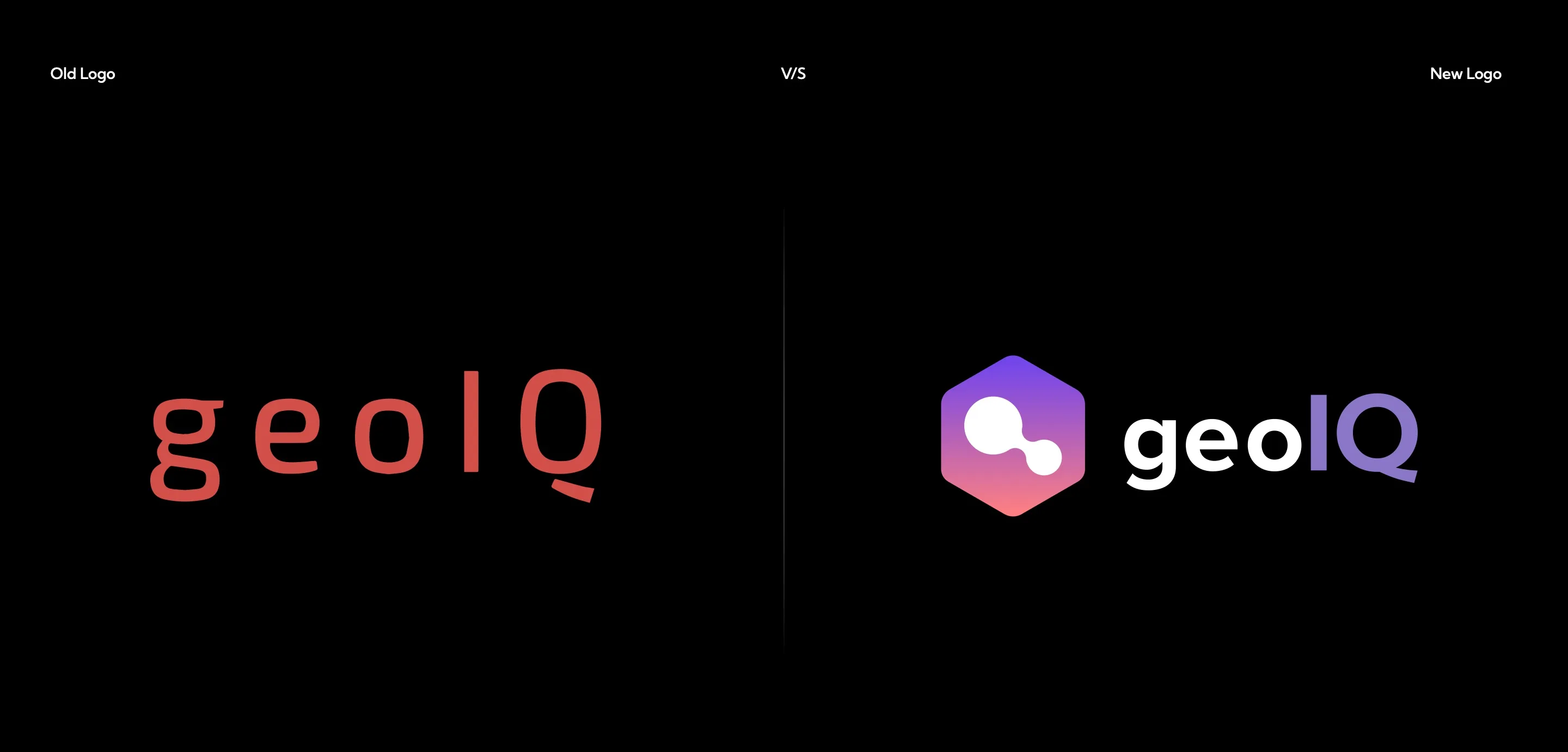
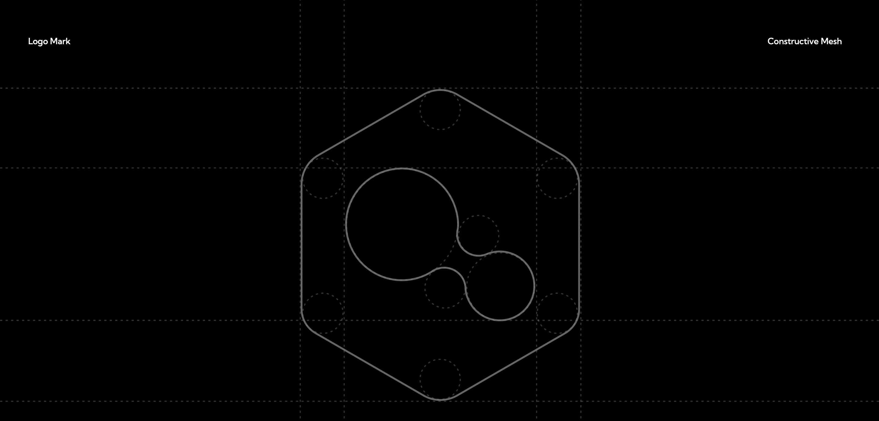
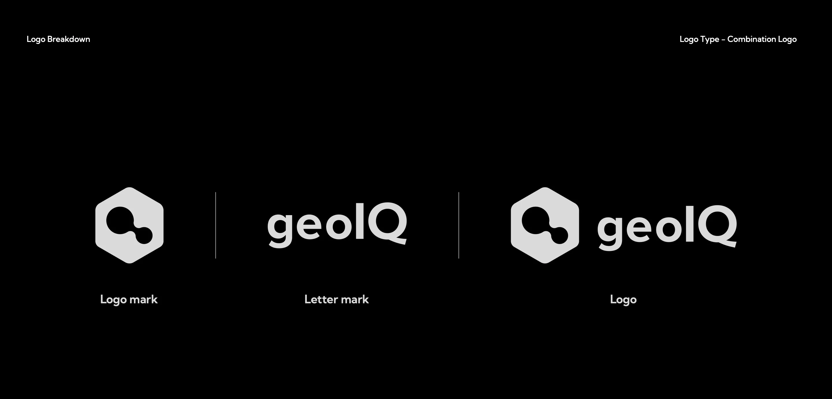
Old logo versus new: the old red, widely-spaced 'geolQ' wordmark on the left; the new gradient hexagon mark and wordmark on the right. The construction mesh for the logo mark: the hexagon with rounded corners and the two joined circles drawn in outline over a grid of guide circles. Logo breakdown: the logo mark, the letter mark 'geoIQ', and the combined logo, shown side by side in light grey.

Type and colour

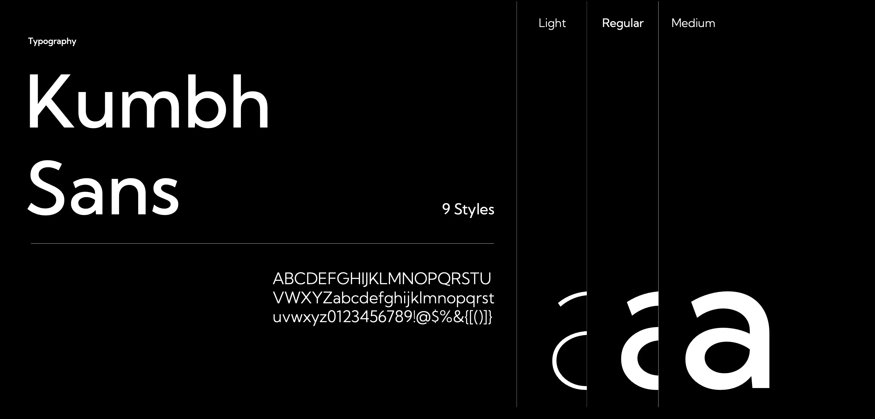
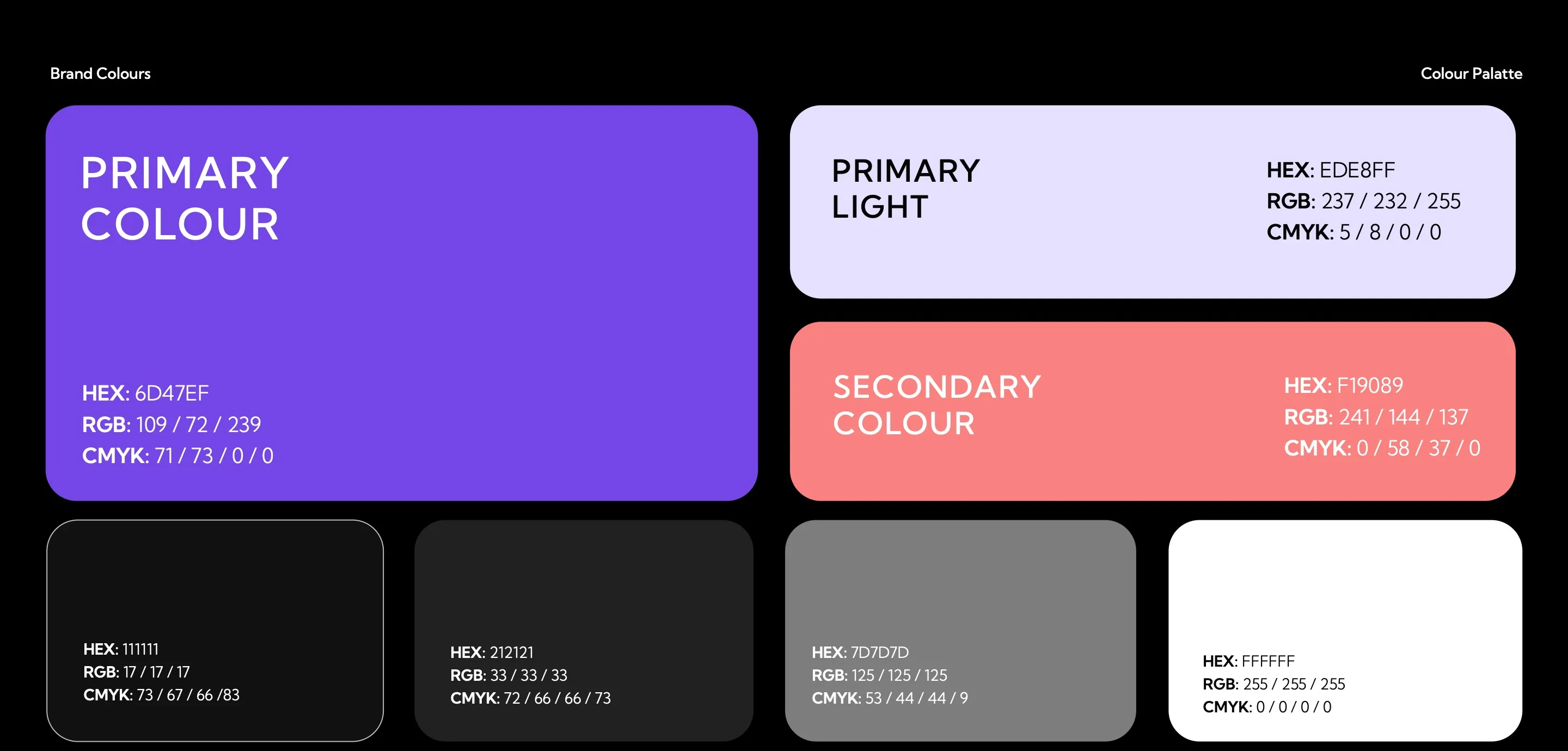
Typography: Kumbh Sans in nine styles, with Light, Regular and Medium weights shown as large 'a' glyphs. Brand colours: primary purple #6D47EF, primary light #EDE8FF, secondary coral #F19089, and neutrals #111111, #212121, #7D7D7D and white, each with HEX, RGB and CMYK values.

Icons and illustration

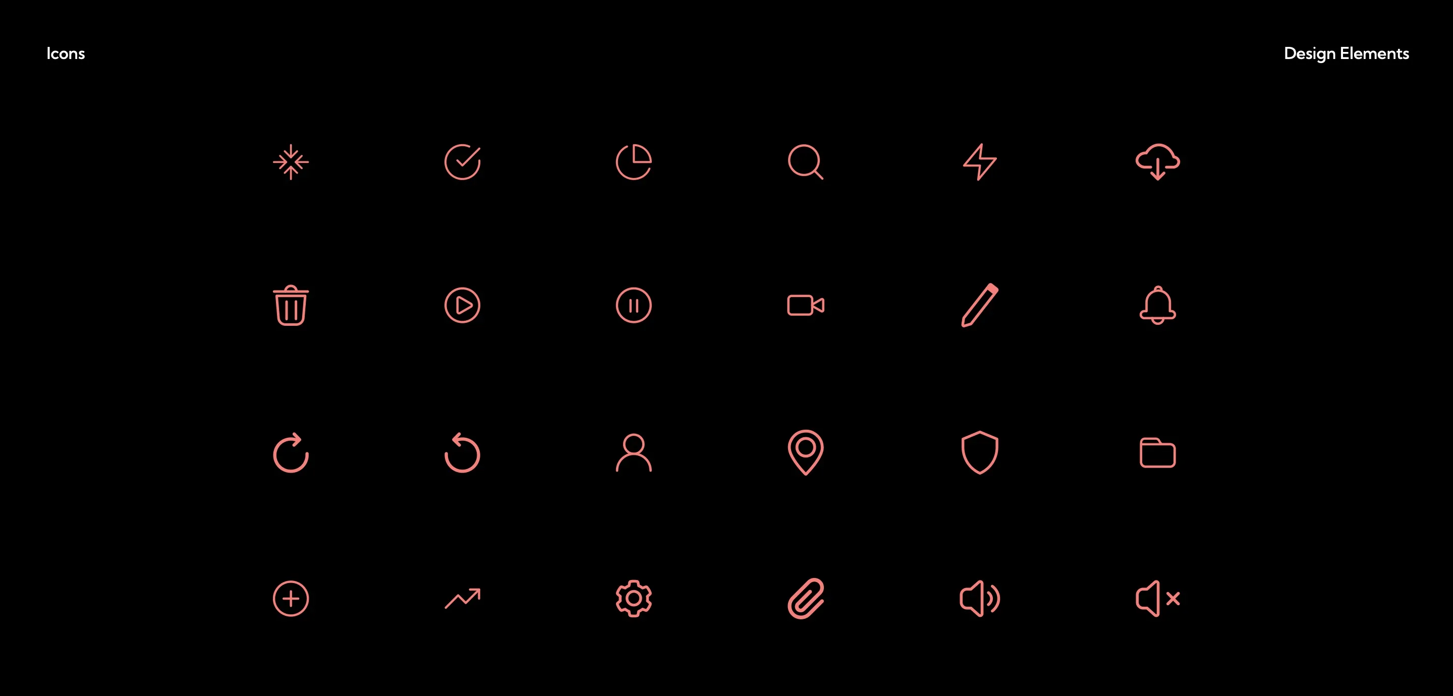
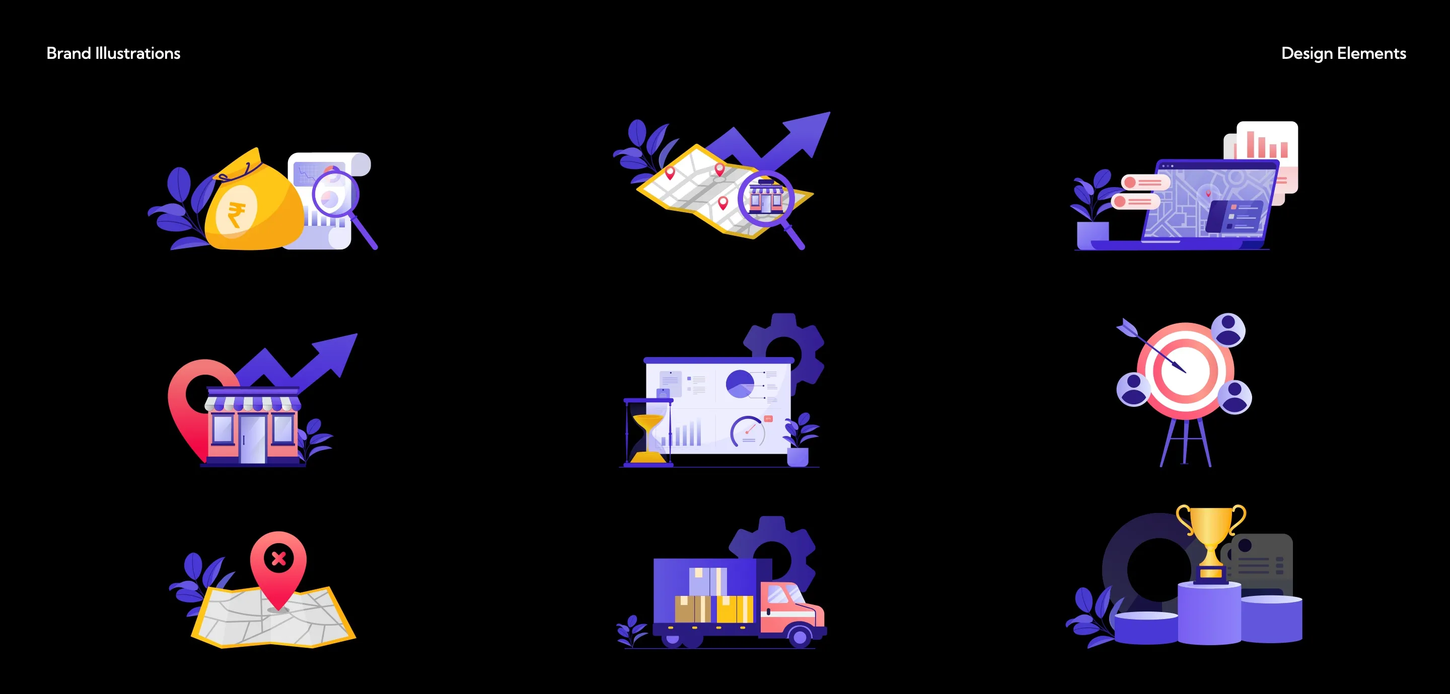
A grid of 24 line icons in coral: search, lightning, cloud, bin, play, pause, video, pencil, bell, refresh, user, location pin, shield, folder, add, trend, settings, attachment and volume. Nine brand illustrations in purple, coral and yellow: a rupee bag under a magnifier, a map with a rising arrow, a dashboard, a storefront with a location pin, analytics with an hourglass, a target with people, a map with a cross pin, a delivery truck, and a trophy on a podium.

In use

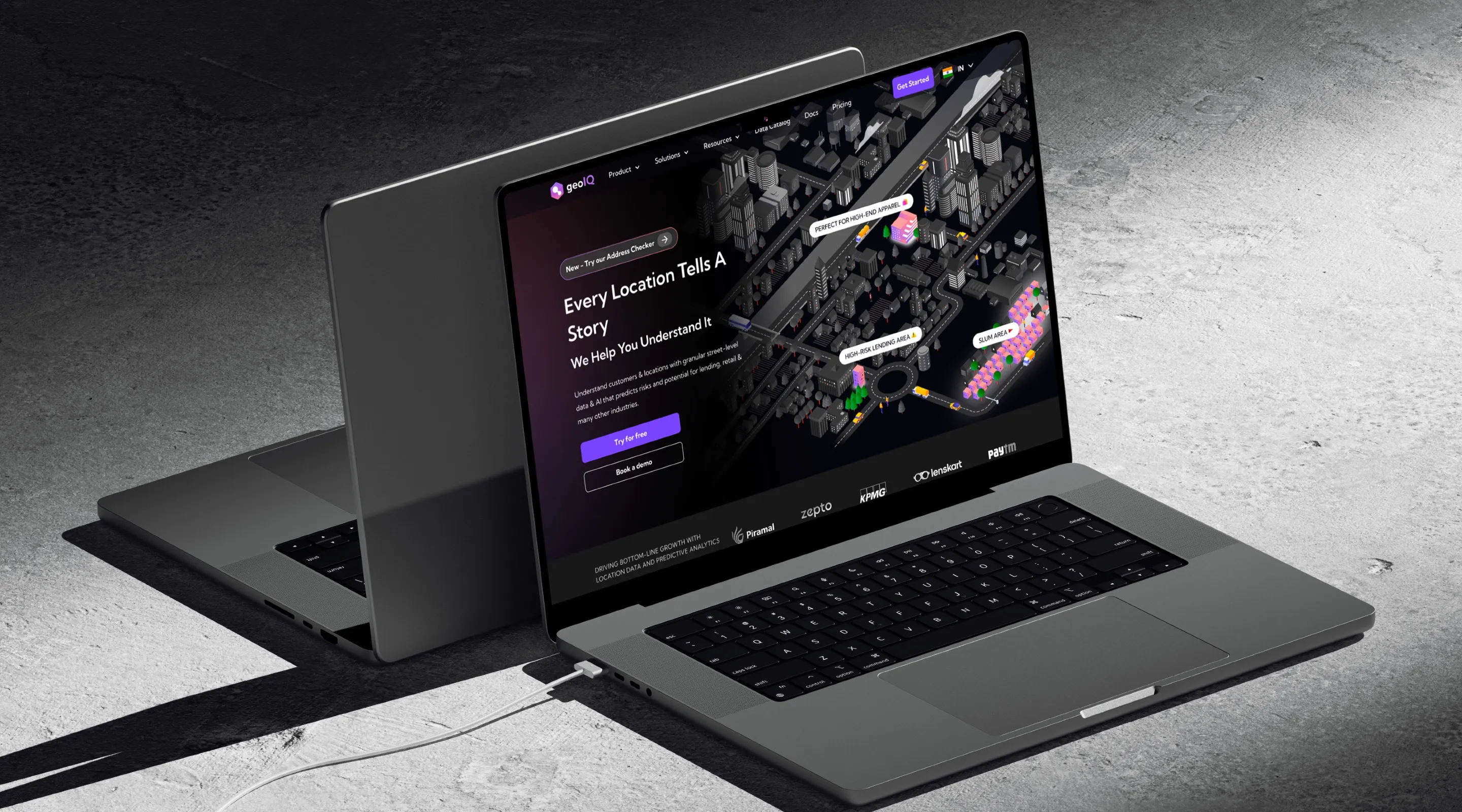
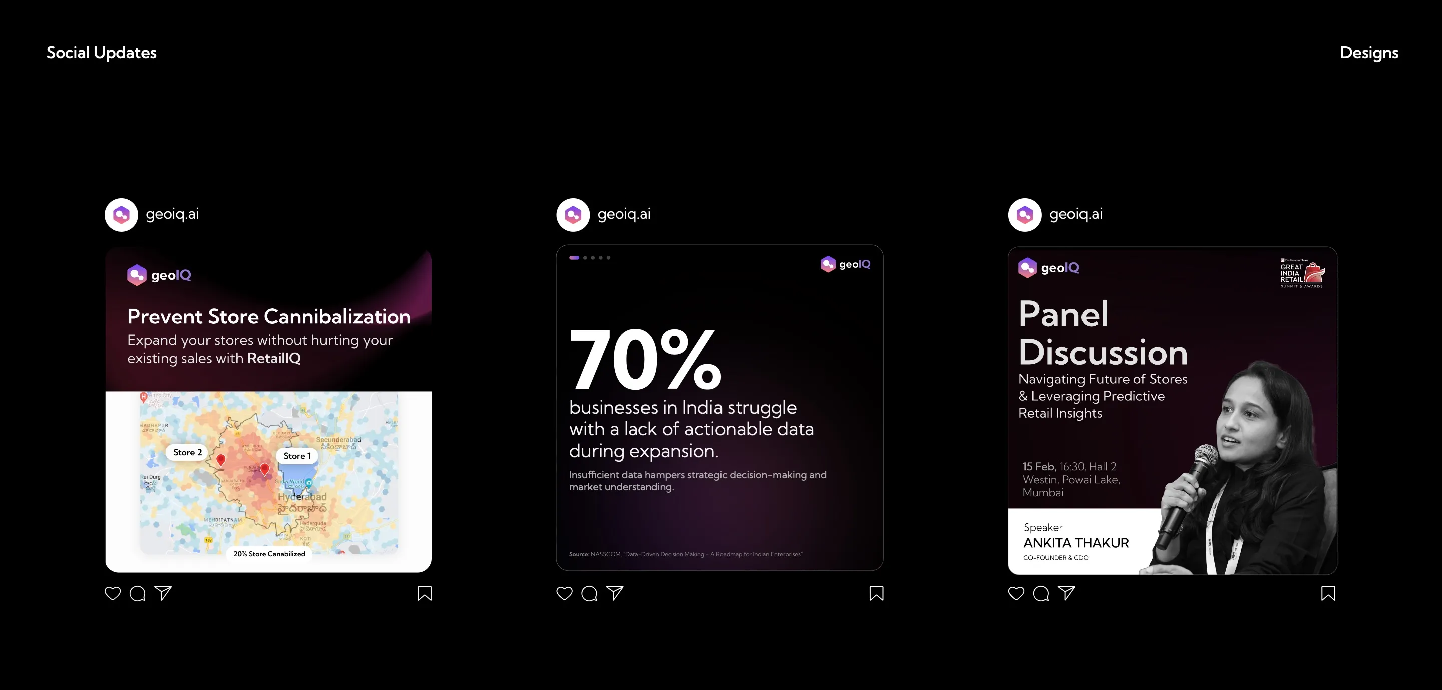
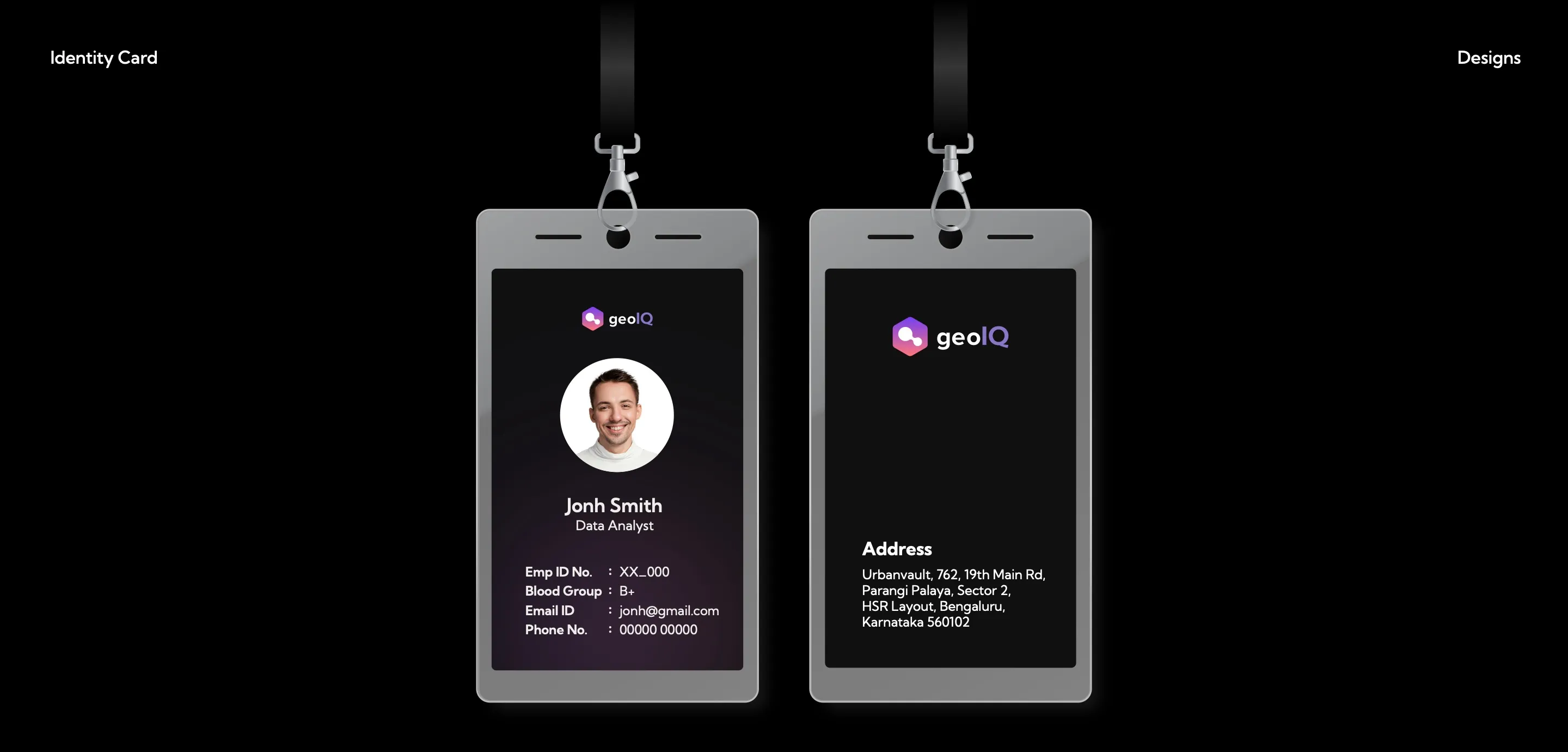
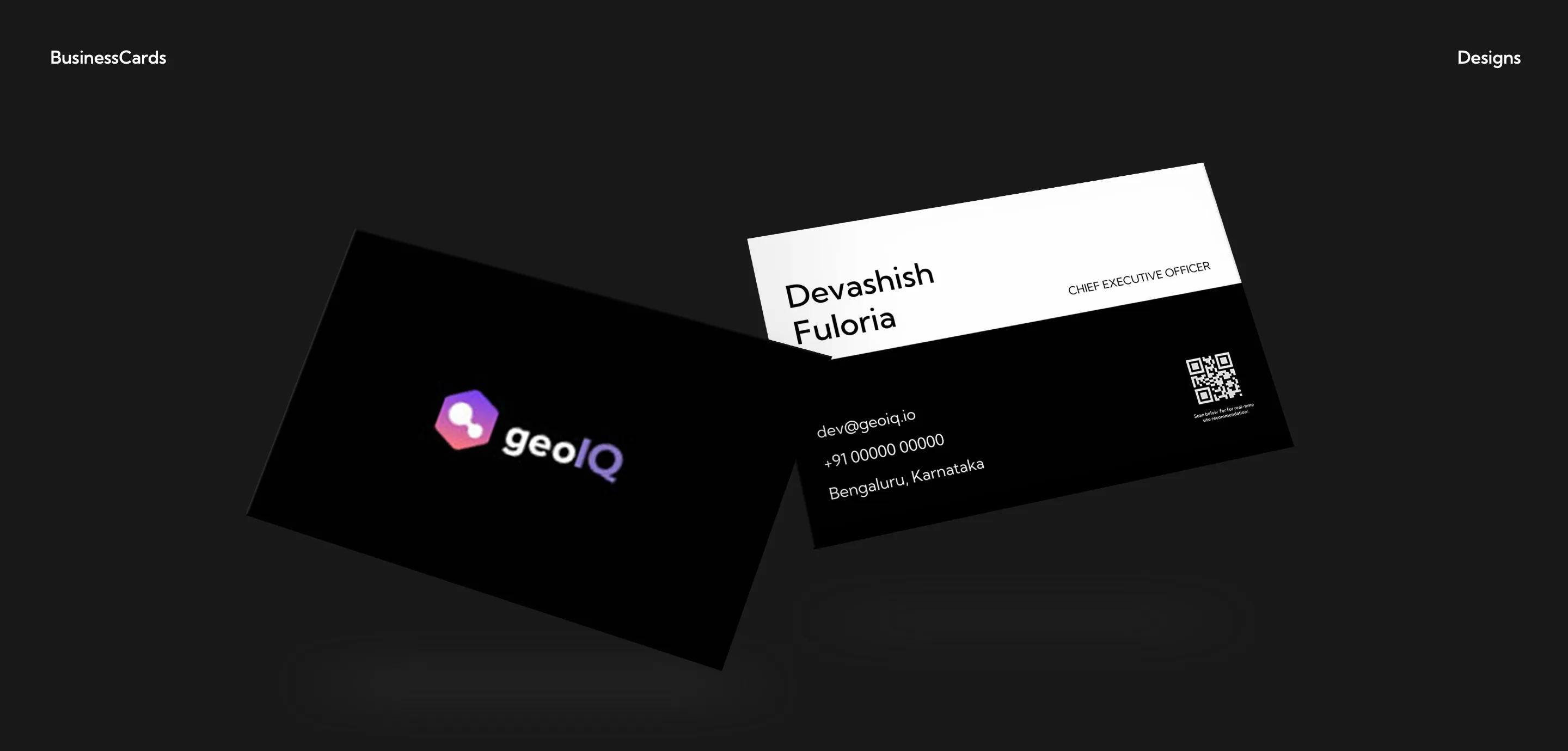
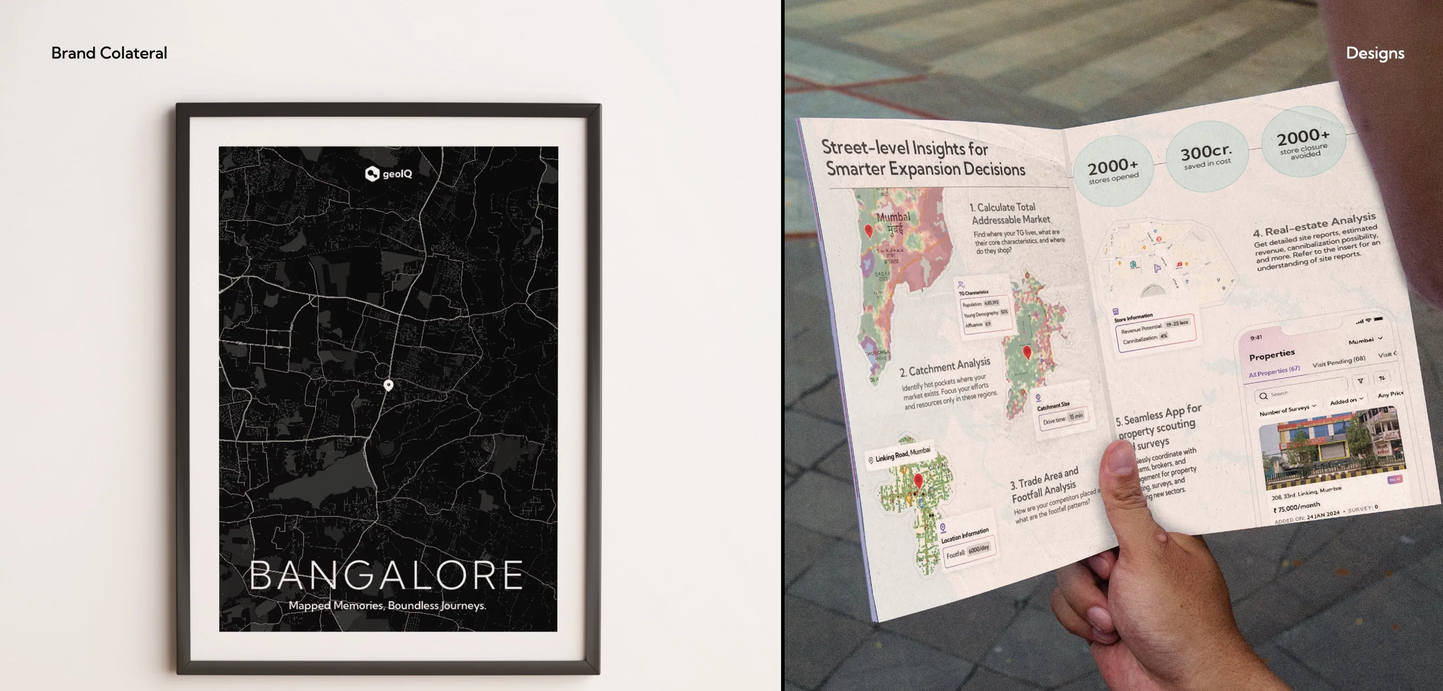
GeoIQ's rebranded website, 'Every location tells a story', on two laptops in a dark studio setting. Three social posts: 'Prevent store cannibalisation' over a heat map, '70% of businesses in India struggle with a lack of actionable data', and a panel-discussion announcement. Employee ID card, front and back, on lanyards: dark card with the GeoIQ logo, a portrait and staff details on the front and the office address on the back. Business cards: a black front with the GeoIQ logo, and a back with the name, title, contact details and a QR code. Brand collateral: a framed 'Bangalore: Mapped memories, boundless journeys' map poster, and a hand holding an open brochure titled 'Street-level insights for smarter expansion decisions'.

Credits

  • Art direction: myself
  • Design: Puja Kundu
  • Client: GeoIQ